Skip to content

  • Home
  • About me
  • What I do
  • About
  • Contact

Tag: logo

Is it still necessary to invest a lot of time and effort into creating a logo?

Published on 20/05/2019 by brandconsultantasiaLeave a comment

You’ll often hear creative teams talk about how beautiful or full of ‘meaning’ their concept logo or brand identity is. That it’s a visual representation of the business and communicates the very essence of the organisation.

They’ll tell you that your brand’s personality is reflected in the logo and that in a social media world the logo is more important than ever and that it must be the trigger to an emotional response and therefore is a key strategic imperative.

Unfortunately, far too many CEOs are seduced into believing every thing they say and many are convinced that a logo or brand identity is a strategic initiative when it’s not, it’s simply one (increasingly insignificant) tactic of many that make up branding.

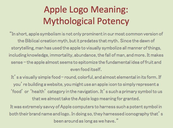
OK, let’s take a step back for a minute and look at one of the most recognisable logos in the world, Apple. If you Google, ‘what does the Apple logo communicate’ the top result is this page from culture creation.

If you can’t be bothered to click on the link, here’s the description, “In the Bible, Adam and Eve are tempted, by Satan, to taste the fruit from the tree of knowledge.

Eve…gives in to temptation and takes a bite of an apple. Once Adam and Eve had their first taste of knowledge, they knew that they were naked, and they were ashamed. That first bite of the apple represents the fall of man.

The apple symbol – and the Apple computers logo – symbolizes knowledge.”

The article then goes on to introduce us to the Apple as the forbidden fruit, although it could have been a pear for all we know. We learn about the significance of the Apple in Greek mythology and the article closes with:

The Apple logo meaning apparently

WTF?

I don’t believe a word of it even though I’m a big Apple fan. What’s important to me is the fact that Apple makes great products and the experience of dealing with Apple is nearly always memorable, for the right reasons.

I think I speak for the majority of people when I say that I really don’t have the time or the inclination to analyse the meaning of a logo when I’m deciding on which company I want to buy a product from.

And even if I did, it wouldn’t make me keep going back to that company if the product/service etc wasn’t top notch. Especially for a luxury product like Apple.

And if the logo were so important, and so much thought goes into it, then what’s going on with this billboard seen around Kuala Lumpur at the moment? Why does this billboard feature 18 logos?

If a logo is so important, why does this billboard feature so many?

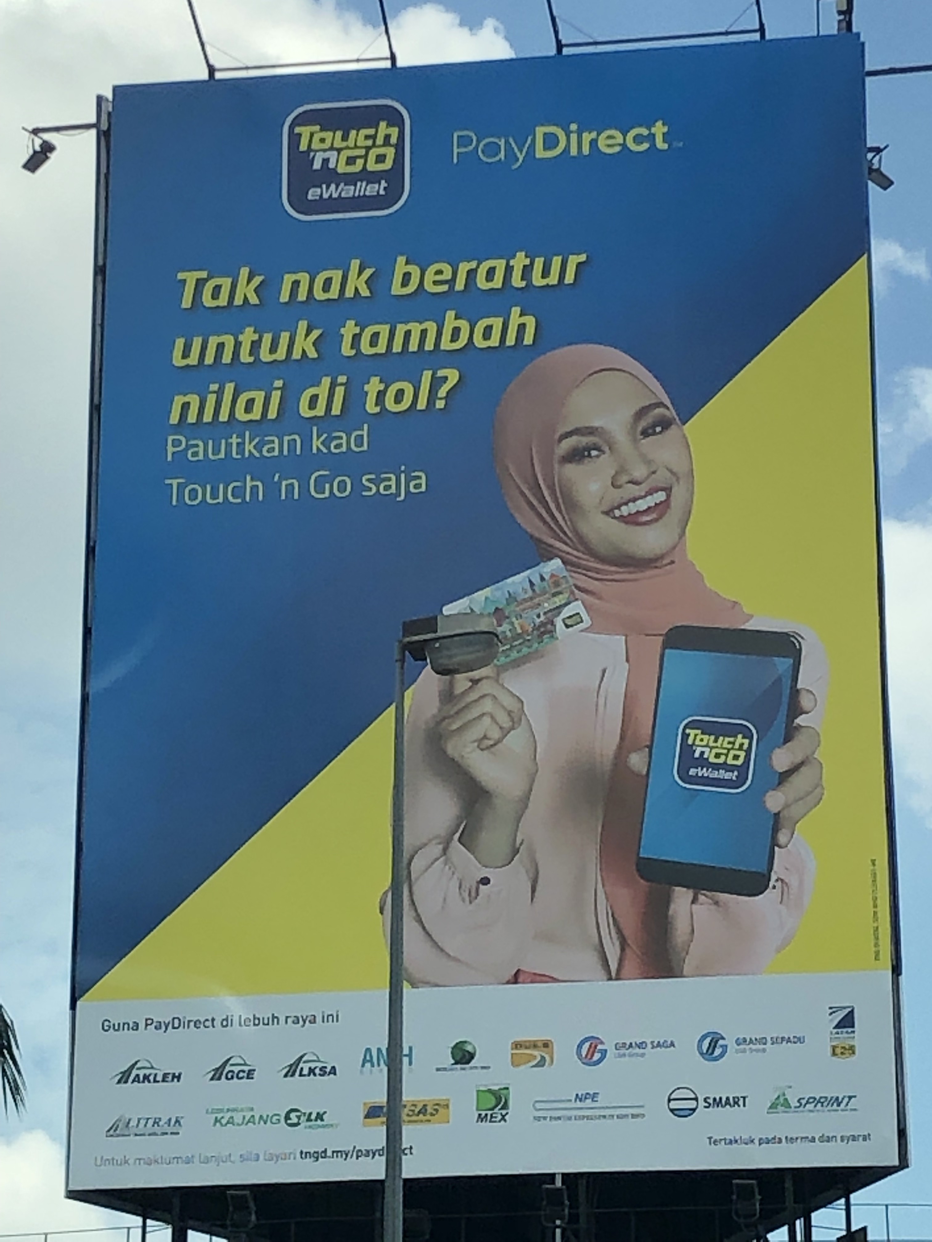
Are we supposed to analyse every one of these logos to determine what exactly they mean and whether they resonate with us? All done while sitting at a traffic light when we also need to check our WhatsApp, email, missed calls and sports results?

The fact of the matter is that in this day and age, a logo is nothing more than a symbol. It certainly isn’t a brand, strategy or branding. And while symbols may resonate with our inner pagan, it’s only over time and following multiple memorable interactions with the business across numerous touchpoints, does the business gain any meaning at all.

Building that meaning is what we call branding. You can’t manufacture it. You can’t have it. It’s something that builds up over time. And while you can nurture it, you can’t determine it. That requires a clearly defined strategy, an ‘on brand’ workforce, continuous engagement and a helluva lot of luck.

There’s no shortcut to branding. But branding should be what every business is focussed on because it has multiple internal and external benefits including attracting better quality talent, products or services that sell more quickly and at higher prices, better customer relationships that increase more profitable repeat sales, blocked competition and, of course, sustained profitability.

But most CEOs don’t seem to be able to grasp this. Or perhaps they just don’t have the stamina to build a brand. Preferring the campaign over the connection, the creative over the substantial, the superfical and irrelevant metrics such as likes over relationships.

Talking of likes, social media has made the logo even more irrelevant. When businesses could control the message, too many of them lied to consumers about their products or services. Even though the logos were great, consumers became jaded and suspicious and trust was eroded. More on social media later.

Nowadays consumers ignore much of what they see or hear brands tell them. They get their inspiration not from a cool advertising campaign but from the experiences of those they know and/or respect. In 2018, Nielsen reported that 83% of consumers believe recommendations from friends and family over all forms of advertising.”

If all advertising includes a logo and what advertising is saying is believed by only 17% of the population, what is the point of the advertising and, by default, the logo in the advertising?

It’s normally about now that people refer me to big brands like Samsung or Nike. If you use either of these global brands, ask yourself if you would have bought them the first time if everyone you know said the products were crap. Of course you wouldn’t.

That’s not a company name, that’s a logo. What type of logo? A logo type…

Also ask yourself if you would continue to buy them if the products were hard to find, staff in stores were rude and as a result, the experience of buying them was underwhelming. Of course you wouldn’t.

And while we’re at it, I would argue Samsung doesn’t have a logo although the purists will say it’s a logotype but whatever it is it’s not a logo like Nike or Apple but still sold US$40 billion of products in 1Q2019!

20 years ago if you wanted to buy Nike products in Malaysia, you had to find the large wire basket in the corner of Isetan or Metrojaya with a few items of clothing, a couple of pairs of trainers and little else.

If you were lucky enough to find a member of staff, they rarely knew anything about sport and often covered cosmetics and household as well as all the brands in the sports departments.

When Nike decided to take responsibility for the brand in Malaysia, they didn’t create a new logo, instead they took ownership of the experience and now have 10 flagship stores in Kuala Lumpur and at least 6 more across the country.

To make that logo even more irrelevant, consumer lives today revolve around social media. Everything consumers do is influenced by their interactions on social media.

It’s only logical then that social media has to play a pivotal role in your brand strategy. But social media isn’t a passive channel like a TV. It’s interactive and is tailor made for participation not passive acceptance of corporate driven messages. Or your logo or your identity.

The great thing about social media is that it allows businesses to leverage word of mouth and to a wider audience far more quickly than ever before. But this takes time, resources and the right investment and commitment.

The four places you can find most of the planet’s population

Most businesses are too lazy to do it properly. Or perhaps they are seduced by the creative agency sales pitch. As a result they use social media just like another media channel and despite the fact that consumers don’t trust them, still try to tell those consumers what they want them to hear.

They think they can manufacture a brand in the same way as businesses did in the past, often through a cool brand identity and logo.

But for so much better educated consumers who spend so much of their time on social media where content is distributed via titles and headings, screen grabs or personal shares, the logo no longer has a significant role to play in defining the brand.

It doesn’t matter who designed it or what meaning it has, the logo has become irrelevant. In much the same way as DVDs, CDs, audio tapes and many other tools from similar eras.

So if you are looking to rebrand your business and you have invited agencies or consultancies to present to you, I strongly recommend that don’t be dazzled by the creative images or past brand identities because those are not what is going to make your rebrand a success.

Focus instead on their processes and systems to review your brand internally, identify gaps or pinpoint weak spots in your brand experiences. Focus on their approach to collecting and using data.

Their approach to retaining not acquiring customers and how they will communicate with them once they are retained.

Focus on their understanding of the nuances of social media and how they will accelerate your online narrative. Don’t be seduced by how many logos they’ve created for businesses in your sector. Or on the promises about how your new logo will be seen by millions of people daily.

Focus instead on how they are going to spend hours nurturing your brand through every touchpoint every time.

Advertisement
Categories advertising, branding, creativity, data, logo, Malaysia, Retention•Tags brand strategy, branding, is a logo still relevant? Marcus Osborne, logo

Was the new Yahoo logo the most underwhelming brand related event of the year?

Published on 18/10/201318/10/2013 by brandconsultantasiaLeave a comment

I get the impression a lot of people have completely missed the fact that Yahoo has changed its logo. Either missed it or don’t care.

Yahoo put a lot of effort into creating some theatre around the launch of the new logo by releasing 1 of the submitted designs every day for 29 days in the lead up to the launch of the chosen logo. Many of the designs shortlisted were a lot more radical than the final choice.

And the final choice, according to Yahoo CEO Marissa Mayer, “reflects Yahoo – whimsical, yet sophisticated. Modern and fresh, with a nod to our history. Having a human touch, personal. Proud.”

Mayer also said, “We didn’t want to have any straight lines in the logo. Straight lines don’t exist in the human form and are extremely rare in nature, so the human touch in the logo is that all the lines and forms all have at least a slight curve.”

You can read a comprehensive justification for the logo on Marissa Meyer’s Blog.

Personally I find the logo underwhelming, especially on the Yahoo homepage where it appears weak, squeezed out by all the content and rather self conscious. What do you think?

The new Yahoo logo at work. Whimsical yet sophisticated or barely noticable?
Categories branding, brands, technology•Tags logo, yahoo, yahoo new logo

What the Malaysia Ministry of Information should have done before creating a new logo

Published on 29/07/201229/07/2012 by brandconsultantasiaLeave a comment

Last week, the Malaysia Ministry of information launched a new ‘logo’ to commemorate the 55th Malaysian National Day.

The universally rejected logo – Not the best creative decision ever made

Traditionally a competition is held to create a new logo and the winner is determined by public votes.

This year the ‘logo’ was created by the creative department of the Ministry and an announcement was made, complete with an explanation for the design on the Ministry website.

The ‘logo’ was released to a barrage of abuse from the Malaysian public. One writer for a respected online newspaper wrote, ““It is an insult to everyone when the government passes off this unbearably disgusting powerpoint screenshot as a logo. Now come on guys, we can do much better than this!”

Another called it “hideous” and another, ‘disastrous.” Within hours there was a Facebook page critizing the logo and calling for it to be withdrawn.

By Sunday, only three days after the launch of the new ‘logo’ the Information, Communications and Culture Minister Datuk Seri Dr Rais Yatim announced on Twitter that the ‘logo’ would not be used.

In late 2010, Gap spent a fortune a new logo, developing an advertising campaign and buying airtime to tell the world about the new logo and what a great and cool company Gap is. A Facebook page was created, essentially to broadcast the same message.

Unfortunately in a foretaste of what would happen to the Malaysia logo, customers, consumers, designers and others universally hated it, expressing their feelings via thousands of tweets and, ironically with Facebook messages on the Gap and other often humourous but always derogatory, Facebook pages.

Under immense consumer and other pressure and in a matter of days, Gap vowed to return to the original logo. But the company spent a small fortune developing the new identity and as a result had little choice but to go ahead with its upcoming advertising campaign.

Gap learned some expensive lessons two years ago and although I don’t thing the Malaysian issue will cost as much financially, a few egos will be bruised.

So what lessons can governments and corporate brands learn from this debacle?

1) Carry out research with consumers/citizens. Even an established brand must carry out research before making a decision that will impact its relationship with those consumers, the people who made the brand what it is.

This is especially true with government organisations, especially in difficult times and when dealing with sensitive issues such as the celebration of the country’s freedom from Colonialism.

The new logo was obviously not tested (Internal testing doesn’t count, especially in government organisations where questioning decisions made by senior personnel is not encouraged). Big mistake.

2) Understand what is a logo and what it can do for you. Sadly it is often the case that there isn’t a deep enough understanding of what a logo can do for an organisation. Furthermore, few institutions protect their logos to ensure consistent use. This is changing, but slowly.

A logo provides a visual differentiation point for your organisation by identifying the product or service you provide. In the case of the Ministry any attempt to create a connection between the country the ministry was representing and her citizens was lost.

Logos do go out of fashion, but a serious misjudgement has been made if the logo goes out of fashion at launch.

When creating a new logo, there are 5 critical factors to take into account:

a. Make sure you can explain the logo in no more than 2 sentences.
b. A logo won’t always be in colour so make sure it looks good in black and white
c. It must be relevant – if you are trying to connect with young people, your corporate identity (and those who speak on your behalf) must be relevant to those people
d. It must be memorable (preferably for the right reasons!)
e. It must be flexible and scalable because it maybe used on a print advertisement, a website, blog, a billboard, a t-shirt, a watch, thumbdrive and so on.

3) Social media is not a fad or to be taken lightly. It plays a critical role in the success or failure of many tactical campaigns – think Tourism Malaysia, Old Spice, The Malaysian Prime Minister and the American President. Social Media CAN effect change so learn to work with it. But remember it is not a soapbox. Simple consumer research at the logo development stage on Facebook and Twitter would have saved The Ministry a lot of embarrassment and also improved citizen engagement.

4) Have a strategy for your tactics. Not many new Logos are well received initially. But many of them are now very familiar – Pepsi, Citi, Accenture, Qantas etc. The new logo was released into the public domain and the Ministry appears to have been taken by surprise at the reaction. Within three days it was withdrawn.

Was that the right thing to do? Was the way it was withdrawn the right way? Was there a plan to deal with negative comments? Who was in charge of managing the social discussions? Why was the Minister, traditionally a macro manager, managing micro issues? Could the logo have been reviewed and reengineered, perhaps after citizen feedback and the discousre leveraged to better use?

5) React quickly and positively. Despite some initial fumbling, the Ministry reacted well to the situation. However, rather than withdrawing the logo, it should have sought suggestions to improve the logo on Facebook. This would have allowed them to engage citizens and build a positive relationship with citizens and encourage them to improve the logo.

The way they then managed the responses and implemented any recommendations would have had a positive impact on the brand and as a result, the government, going forward.

It’s too early to tell what will be the impact of this event on the Ministry, the Minister and the Malaysia Nation brand.

But one thing is for sure, the development and launching of a new government linked logo, related to such an important element of the internal development of the Malaysia Nation Brand must be taken more seriously in the future.

Categories asia, brands, Malaysia, nation branding, research, social media•Tags 55th Merdeka logo, bad logo design, Communications and Culture Minister, Datuk Seri Dr Rais Yatim, Information, logo, Malaysia, malaysia national day, merdeka logo, najib razak logo, national day logo, worst logo

If you like what you read on this blog and think we can help your company save money and build a global brand, please contact us directly

Click here to view our website

Enter your email address to subscribe to this blog and receive notifications of new posts by email.

Join 3,054 other subscribers

Fusionbrand

Fusionbrand

Twitter Updates

  • @ThisBirdy Well…chicken satay, lamb, beef, char kway teoh, prawns, ice kacang, bread & butter pudding, ice cream, cake… 13 hours ago
  • @imzaharah The wedding was 12 years ago 21 hours ago
  • @Rutheran the food was outstanding, as was the entertainment... 21 hours ago
  • @usaashawan Family obligation...But the food, when we got it was superb! 22 hours ago
  • Just got back from one of those VIP wedding anniversary dinners where the VIP turns up late & then there’s the spee… twitter.com/i/web/status/1… 1 day ago

Recent Posts

  • A brand & branding. The 2 things you need to make your ‘work from home’ Instagram offering a real business
  • Recovery branding for Tourism in Malaysia. A Q&A with Marcus Osborne
  • Malaysia Airlines must invest in delivering value not new taglines
  • Why it’s dangerous to hire the wrong freelancer
  • 10 ways to ensure your business becomes a brand in 2020

  • brandconsultantasia

Top Posts

  • Does Malaysia Airlines understand what is branding?
  • Another Malaysia Airlines marketing fail
  • Has the Malaysia Airlines marketing department lost the plot?
  • Insights into branding in Asia
  • Building a country brand requires more than just a well executed advertising campaign
  • How to brand a city like Ipoh
  • A solid brand is built from the inside out
  • Seriously, is #todayishere the new Malaysia Airlines tagline?
  • Which is the best business class from Kuala Lumpur to London? Malaysia Airlines vs Qatar Airways vs Emirates compared

Meta

  • Register
  • Log in
  • Entries feed
  • Comments feed
  • WordPress.com
Website Powered by WordPress.com.
Privacy & Cookies: This site uses cookies. By continuing to use this website, you agree to their use.
To find out more, including how to control cookies, see here: Cookie Policy
  • Follow Following
    • brandconsultantasia.com
    • Join 226 other followers
    • Already have a WordPress.com account? Log in now.
    • brandconsultantasia.com
    • Customize
    • Follow Following
    • Sign up
    • Log in
    • Report this content
    • View site in Reader
    • Manage subscriptions
    • Collapse this bar
 

Loading Comments...