Findings from a number of empirical studies carried out at various times over the past twenty or so years would suggest that a destination logo is an important element of the destination identity and should match the destinations they represent.
Other research would suggest the design of a logo is critical to the success of a destination although the definition of success is rarely defined.
The main role of the logo, traditionally anyway, has been to create awareness about a destination and help to build a positive image about the destination. It is important to note here that the logo itself cannot do this.
The logo is a symbolic reflection of what the destination wants to communicate to audiences but increasingly, as potential travellers and investors use the Internet for research purposes and get much of their information from business networks or consumer generated media, the identity is not as important as the experiences of other like minded people.
Indeed, the role of the logo to act as the lead in a project to communicate with mass audiences is now being questioned. It is also becoming increasingly difficult to be original, traditionally a key ingredient in the development of the destination logo. Which is why we are seeing more and more destination logos that look familiar.
But most important of all is the fact that brands and the building of brands is no longer a creative initiative.
This is particularly true of destinations, especially those destinations that are not just looking for tourists but also investors, talent and strategic partners.
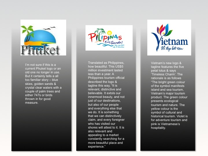
Here are some random logos that I have sourced from the Internet. What do you think? Do they inspire confidence? Do they clearly define what the destination represents? Do they tell the truth? Can they be misinterpreted? Do any of them look as if they have copied other designs and if so, does this negate any positives the destination may be looking to create?